

Navigate on a phone
Find the mobile navigation control in ATSReady and understand how the sidebar becomes a drawer on smaller screens.
On this page
Below 1024 pixels of window width, ATSReady replaces the always-visible desktop sidebar with a floating navigation trigger. That boundary is about the window, not the device: phones, most tablets, and a desktop window you have narrowed all get the same treatment. It is the same boundary the resume workspace uses — see Resume editing on a phone.
What to use instead of the desktop sidebar
Use the control labeled Toggle sidebar, at the top of the start edge of the screen.
It stays in place while you scroll and opens the navigation as a drawer.
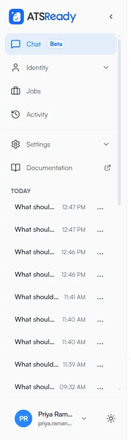
What the drawer contains
The drawer uses the same sidebar navigation structure, including the grouped destinations described on Use the sidebar and the Chat conversation rail when that rail is available for the current account state.
What to expect
- the trigger reports whether the drawer is open or closed
- while the drawer is open it covers the trigger, and keyboard focus is held inside the drawer — so the trigger is not the way back out
- close the drawer with its own ✕, with Escape, or by selecting the dimmed area beside it; selecting any destination closes it too
- the desktop control described on Collapse the sidebar does not apply at these widths, because there is no rail to collapse